Back to basics
Posted on July 18, 2022. Tags: hello, jekyllThis is the first post in the third iteration of my website. I wanted to jot down some thoughts as to why I’ve scrapped and rebuilt my website again, look back on some old designs, and consider future additions to the site.
The old versions of my site are still online! Feel free to click the links in each header and explore what it was like. I’m still quite proud of them!
The progenitor (visit)
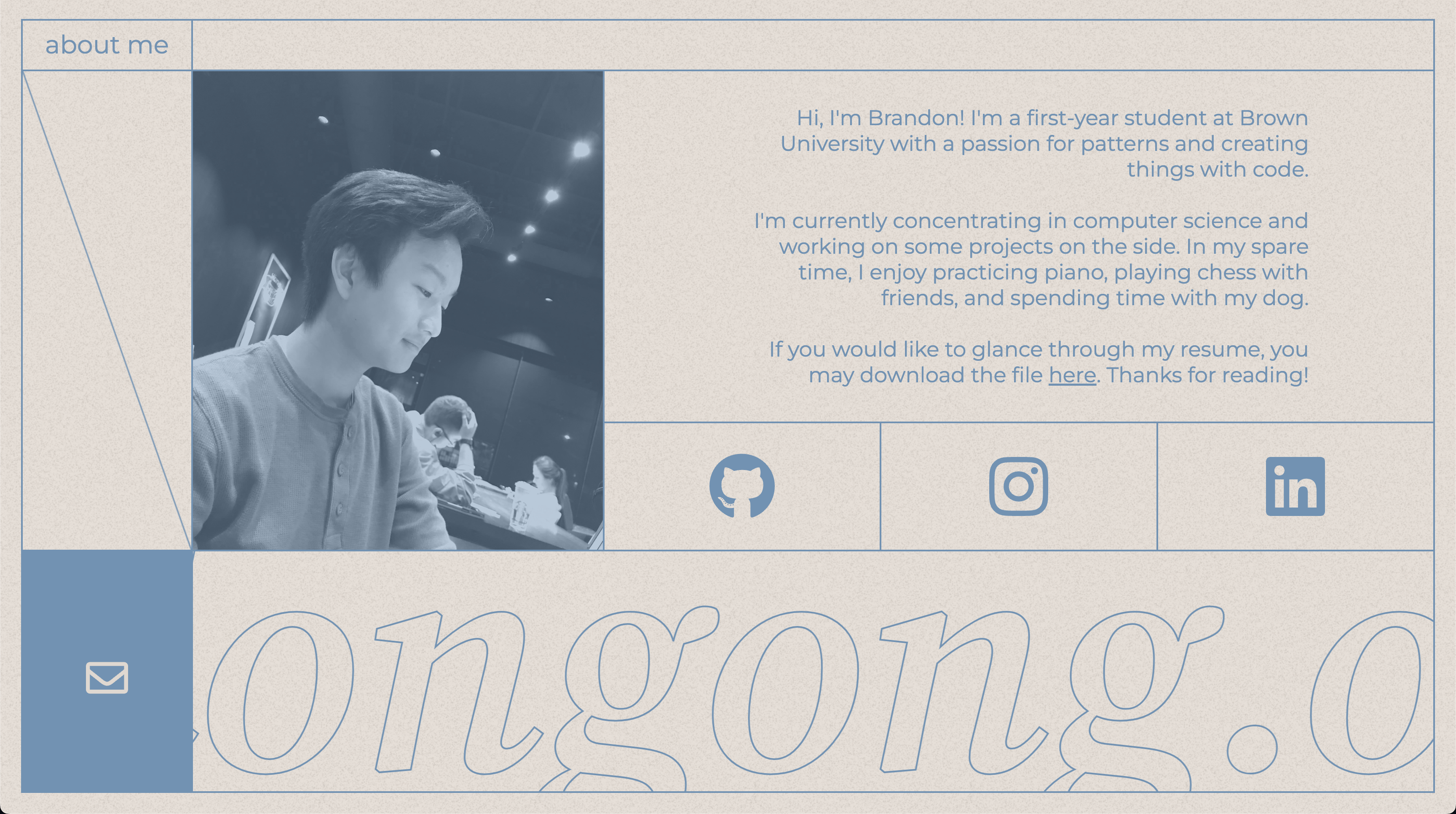
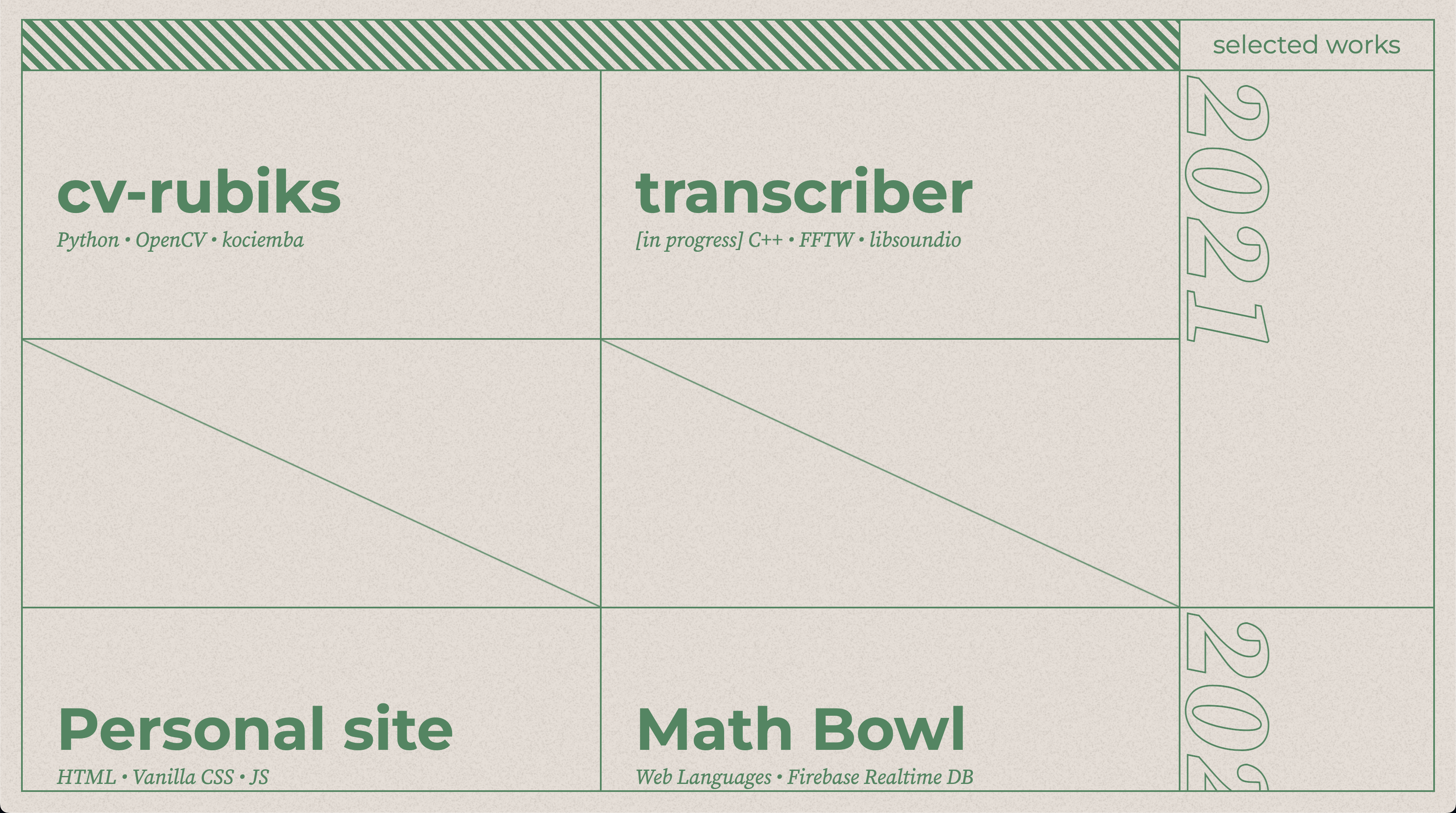
The first version of brandongong.org, designed in early high school, was a beefy, shiny, all-the-bells-and-whistles rendition of a website. It featured an interactive three.js landing page, custom cursor that changed depending on what was hovered, and tons of CSS.
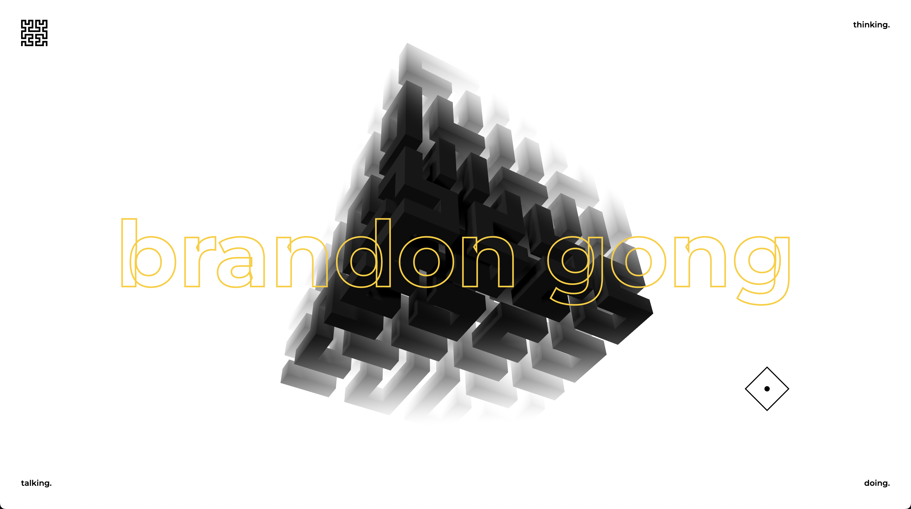 The landing page, featuring an interactive three.js background
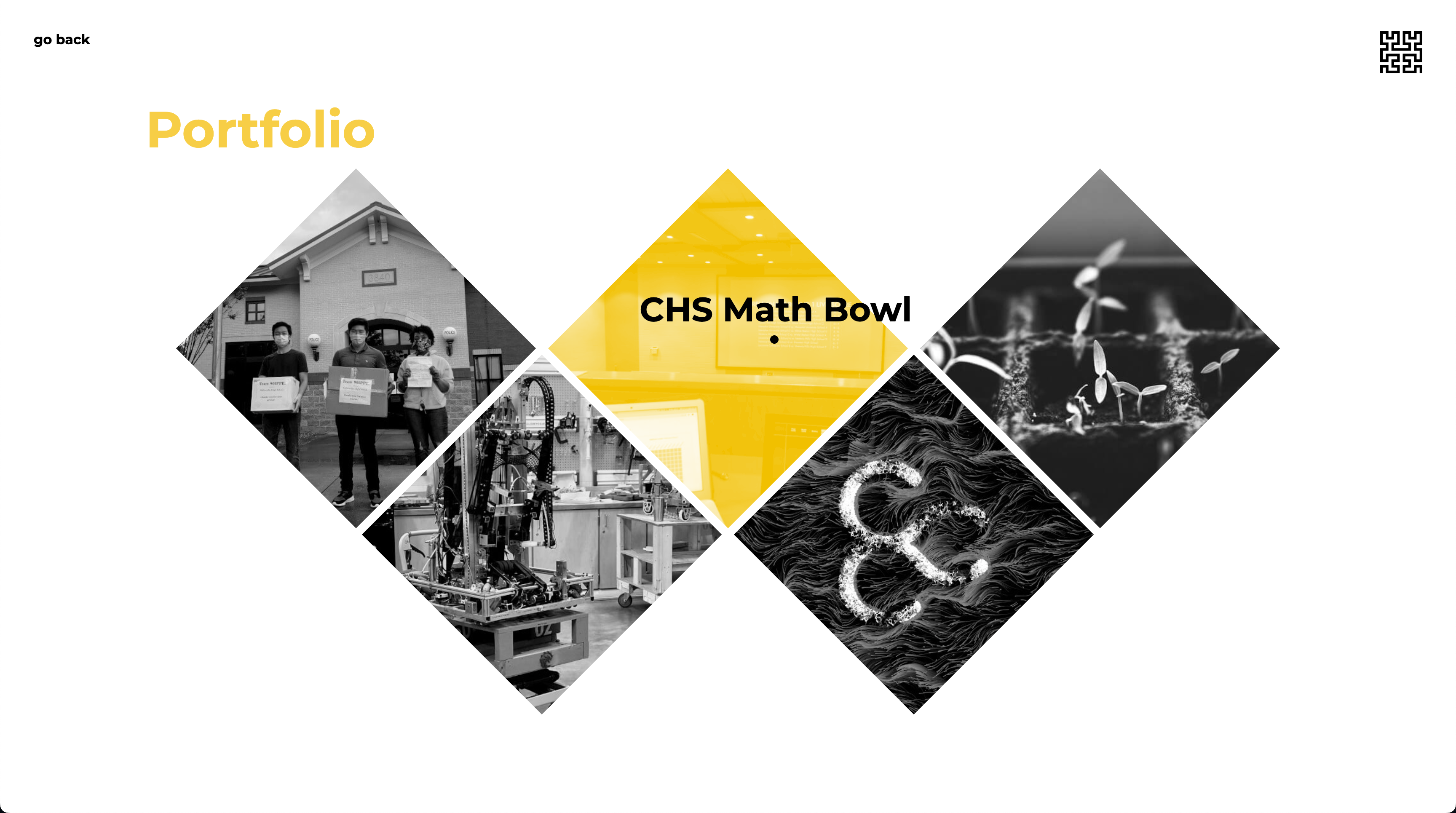 The projects page, with a diamond-grid layout and context-aware cursor
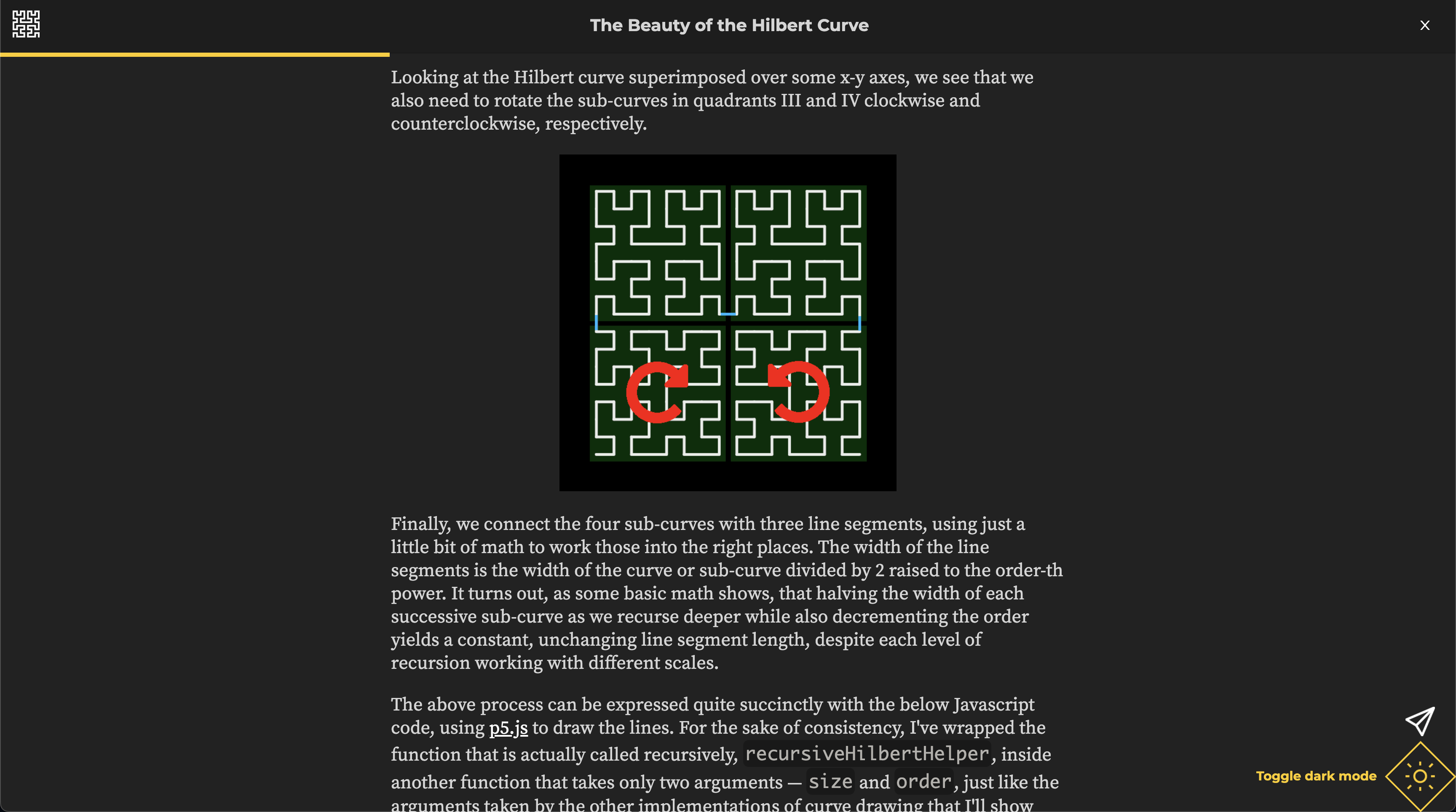 This website even featured a rudimentary blog, with dark mode! (note the
context-aware cursor in the bottom-right)
This website even featured a rudimentary blog, with dark mode! (note the
context-aware cursor in the bottom-right)
It’s clear that at this stage, my tastes were “make it as unique and fancy as possible”. I was inspired by sites on Awwwards and wanted to make my website as unique as possible, just like those.
I still think this design is pretty cool, and quite a unique experience compared to 99% of the web. But there are some major drawbacks:
- It’s horrible on mobile. The three.js animation is extraordinarily laggy, the buttons are small, and in general it’s just not a fun experience.
- Adding new content is hard. The projects layout is pretty limited, and adding new projects and blog posts involves straight up modifying the site’s HTML, which is really not great.
- The uniqueness is also a curse. It’s not super intuitive to use, which means that people who can only afford to spend short amounts of time on the site cannot locate the information they need quickly.
- Adding onto the previous point, search engine crawlers also get super confused about the layout, and I’m sure there’s accessibility issues as well.
The minimalist (visit)
Following the first design, I started to dislike how over-the-top it was with all of its glamorous and wholly unnecessary JavaScript animations and quirky layouts. The second iteration is thus a stark contrast from the first, with flat colors and a single-page layout. I also tried to make it a little “friendlier” by incorporating some more organic features, i.e. the subtle roughness in the background and the flower theme.
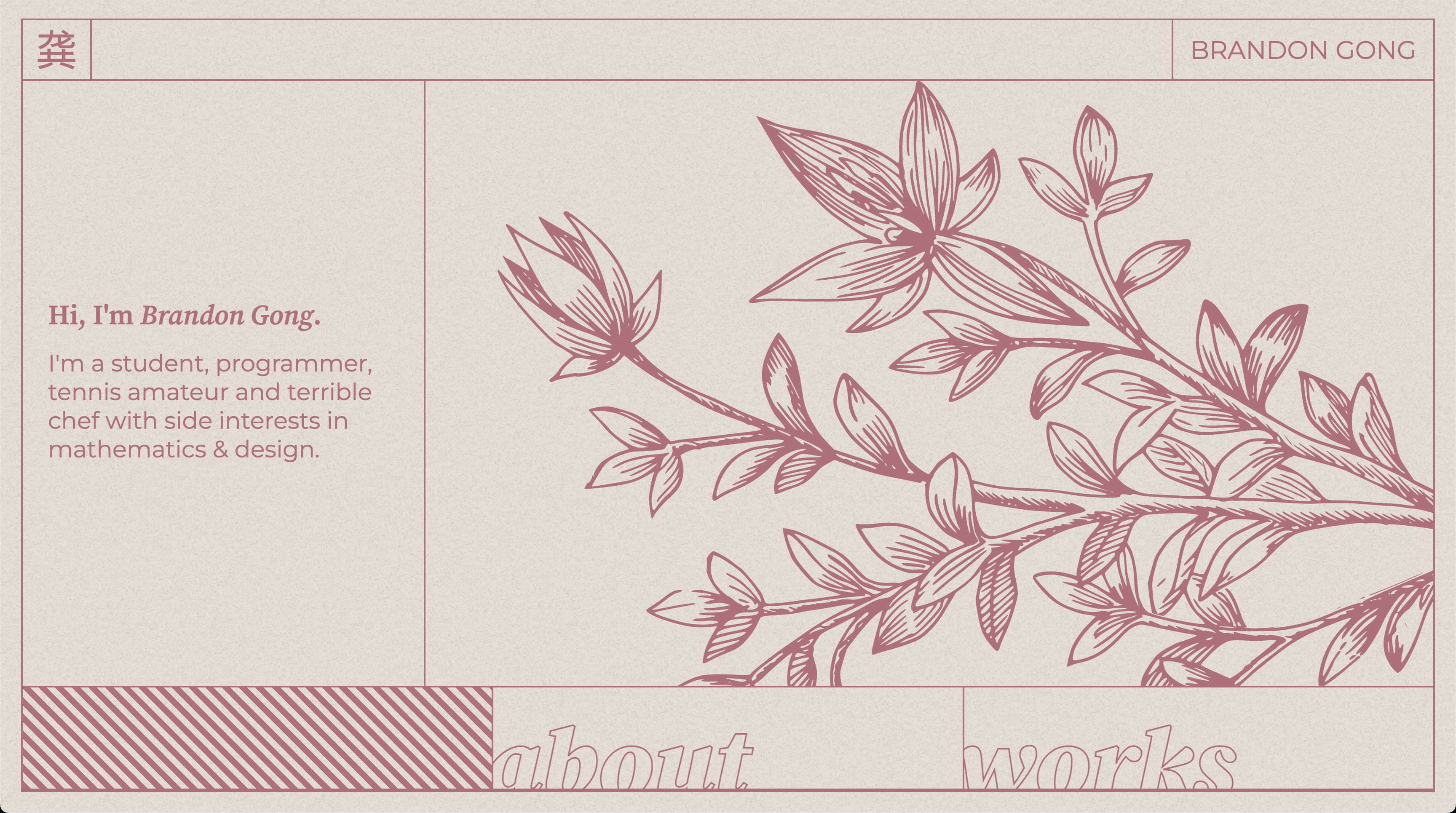 The top of the page.
 As you scroll, the colors fade and change. The site is grid-like, but not
organized into strict columns, which gives it a bit more order than the
previous design.
As you scroll, the colors fade and change. The site is grid-like, but not
organized into strict columns, which gives it a bit more order than the
previous design.
 The projects section can hold a lot more different projects now than the old
design.
The projects section can hold a lot more different projects now than the old
design.
I think the design looks great, and it’s significantly leaner than the first design, with zero dependencies, minimal JavaScript, and optimized assets used on the page. Honestly, I might come back to this design later on, with some tweaks of course. But it also has its caveats:
- Mobile friendliness is improved, but could be better still. The font size is a bit small on some devices, and the positioning of the flowers becomes a bit wonky.
- No blog section. This could be added with not too much issue.
- And the absolute most critical flaw, which is what drove me to redesign it a third time: incredibly low information density. There is close to zero actual info, and its just scattered throughout the page, interspersed with huge amounts of visual fluff.
The utilitarian (current version)
And so that brings us to this third design. The absolute only goal in mind is content-first. No hiding behind a pretty UI, no making people dig for info. The goal is to make info about me front and center (about page is the first page you see), and then to make my activity (projects, learnings) well-documented and easily discoverable.
It’s built on Jekyll, which allows me to write Markdown for posts instead of HTML – making adding new content a breeze. I can add tables:
| Header A | Header B |
|---|---|
| This is a cell | This is another cell |
| etc | etc |
- Easily
- Make
- Nested
- Lists
- And
- Enumerations,
- Make
and even equations in display mode
\[\int_{-\infty}^{\infty} e^{-x^{2}} dx = \sqrt{\pi}\]or inline: \(\int_{-\infty}^{\infty} e^{-x^{2}} dx = \sqrt{\pi}\).
I can also draw diagrams easily!
Code blocks are nice and highlighted:
# Python
def hello(x: str) -> None:
  print(f"Hello, {x}!")
// Rust
fn main() {
  println!("Hello world!");
}
-- Haskell
main :: IO ()
main = putStrLn "Hello world!"
and inline code looks decent too.
With all of these features together, Jekyll gives me a powerful tool to easily put out new posts.
Future plans
For now, I hope to keep and polish up this design. It’s a great setup, offering plenty of flexibility, so I have a lot of things I could add.
One of the major things I want to do is add a search function to the blog, where users can search fuzzily by text or filter by tag. This should be fairly easy to setup, and I’ll probably integrate with fuse.js to make it happen.
But for now, when the blog content is still fairly sparse, I’ll leave the yak-shaving for another day.