Tabliss and the system theme
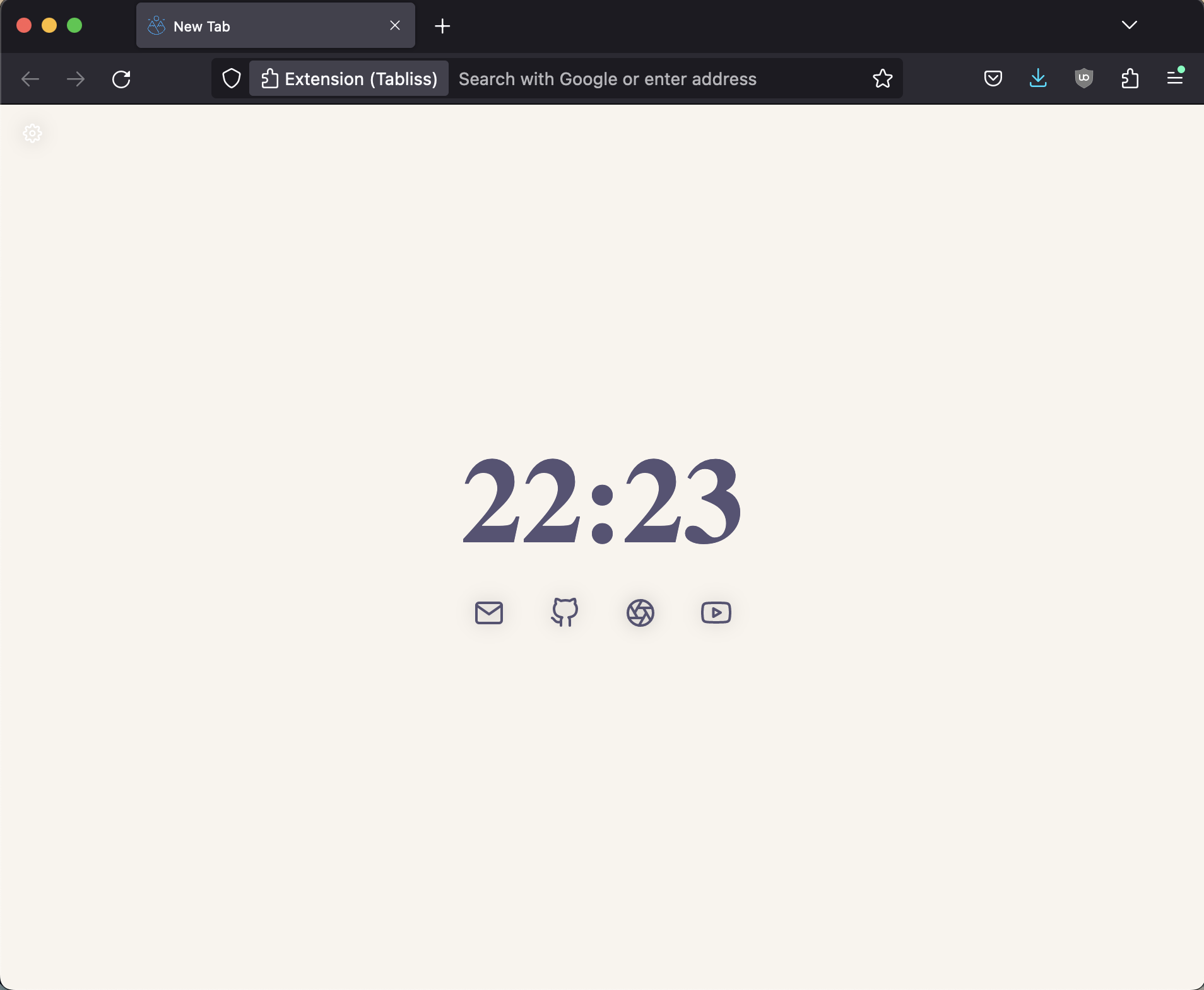
Posted on April 28, 2023. Tags: css, yak-shavingI’m a fan of FireFox, but not its distracting startup page, so I enjoy using Tabliss for my new tab needs. I set the background to a clean, solid color (matching the theme I use for my editors and terminal, because why not, it looks good) and display some minimal widgets for the websites I use regularly:

 A comparison of the default startup tab and the Tabliss setup I use.
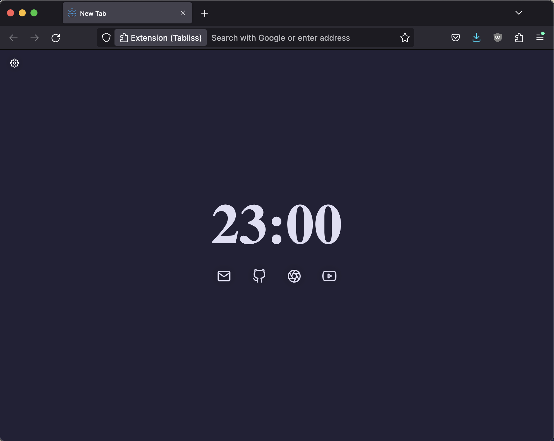
Now this looks pretty good, in my opinion, except when the evening rolls around, and my computer (running macOS) switches to dark mode for the night. I’ve set up Sublime Text (my editor of choice at the moment) to make the jump right along with the OS, so it seamlessly switches from Rosé Pine Dawn to Rosé Pine Moon, but Tabliss doesn’t have any built-in functionality to detect the system theme and adjust automatically.
And with the light Tabliss theme I have set up, opening a new tab at night can be a bit of an ouch.
Luckily, the lovely developers over at Tabliss left an escape hatch for us to use, the Custom CSS widget. This is our key to creating new functionality that wasn’t already baked in for us.
After a quick Google search, I learned about the CSS prefers-color-scheme
@media query. This is definitely super handy to know about (and you may even
see some of that CSS get incorporated into this site as a whole at some point!),
since it’s exactly what we need. The basic structure of our code will look
like this:
@media (prefers-color-scheme: dark) {
  /* Dark theme CSS styles here */
}

@media (prefers-color-scheme: light) {
  /* Light theme CSS styles here */
}
Next, we can use Firefox developer tools to figure out what CSS classes we
should edit. I found that the solid background color was created by the element
with class .Colour, and all of my other components (the clock and the icons)
are in elements of the class .Widget. So, we can build out our rules like
this:
@media (prefers-color-scheme: dark) {
  .Colour {
    background-color: #232136 !important;
  }
  .Widget {
    color: #e0def4 !important;
  }
}

@media (prefers-color-scheme: light) {
  .Colour {
    background-color: #faf4ed !important;
  }
  .Widget {
    color: #575279 !important;
  }
}
(The !importants are, well, important, since Tabliss inlines some CSS, and we
need to override them with our own.)
To put it into action, add a Custom CSS Widget in the Tabliss settings pane, and watch it go to work!
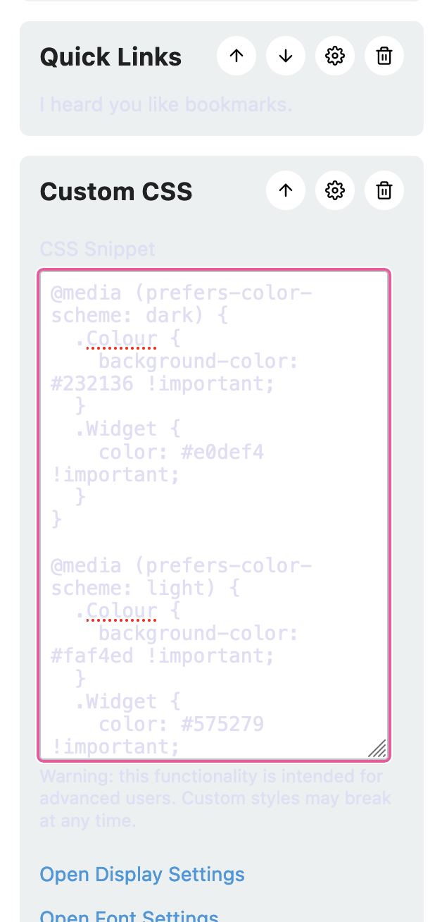
This works, but something mildly annoying about it is that it makes the settings pane pretty much unreadable at night, because it’s light text on a light background:

This is quite easy to fix; I just found some parent element of the actual
.Widgets I want to change. In my case, I found that the on-page widgets had
a parent wrapper div with class .Widgets, while the settings pane had no such
parent. So all I need to do is tweak my CSS selectors to be more specific about
which .Widgets I actually mean:
@media (prefers-color-scheme: dark) {
  .Colour {
    background-color: #232136 !important;
  }
  .Widgets .Widget {
    color: #e0def4 !important;
  }
}

@media (prefers-color-scheme: light) {
  .Colour {
    background-color: #faf4ed !important;
  }
  .Widgets .Widget {
    color: #575279 !important;
  }
}
And there we go! Looks good to me.
